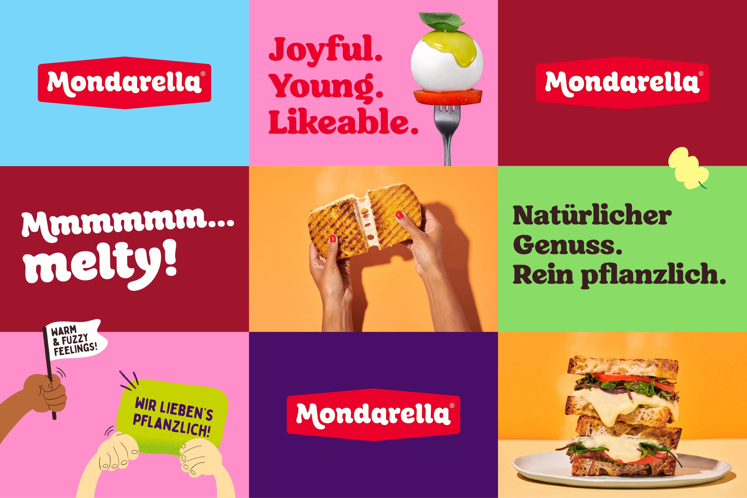
For Mondarella’s word mark, we revisited the prior logo (also developed by Very Good Looking) to double down on the brand promise: Cheesy deliciousness, but with quality ingredients.
While we kept the heritage-inspired frame to signal the brand’s artisanal roots, we “melted” the logo fonts to signal what it’s all about: Melty cheese indulgence.
To ensure results, and make them tangible, we tested our work every step of the way. Renowned marketing researcher Appinio helped us align design choices with consumer data.
After several rounds of refinement, final designs scored #1 in on-shelf-comparison, with about 86% of disposition to buy among flexitarians and a whopping 94% desirability, especially with a younger demographic.